Simple changes to improve your comedy video quality
Sketches (“skits” or “what they do on SNL” to laypeople) are easier to film (and get in front of people) than ever before. They’re a great way to build an online audience. They can also be used as an online portfolio that you can send to festivals, industry insiders, or curious relatives.
Here are a few tips for the beginning sketch-creator. (Note: This article would take a hundred years to read if I included every exception to the rule, so I just listed the most important ones.)
Understand Differences in Mediums
Social Media is not just one thing (even as it’s increasingly becoming one big, scary monopoly). Both viewers and algorithms react to variables differently based on the platform you’re on. Here are some generalizations to know:
-
YouTube
This platform has the highest expectations for technical quality, including filming, editing, sound, and writing. If the other platforms are for throwing shit against the wall, Youtube is for refining your shit into compost, packaging it nicely, then throwing it against the wall.
I will often make a video on one of the other platforms on a whim, within a waking dream, if I’m a little bit drunk, etc. But for Youtube, I try to get script feedback from a couple of people who I am at least 80% sure don’t hate me.
If you’re on a sketch team, use it as an opportunity to get a sketch in front of a live audience and punch up the jokes that don’t land before you film it.
I’ve watched quite a few youtube videos with titles like “How I Went From Zero to One Trillion Followers” and the TL;DR of it all is (1) thumbnails, (2) catchy titles, and (3) the things that apply to all platforms (see below).
A thumbnail is the picture Youtube displays for a video before you click on it. When you upload a video, Youtube will automatically generate a couple of thumbnail options you can choose from. These suggestions are never friendly in nature.
I encourage you to always create a custom thumbnail and upload it. Ideally, take an exciting frame from the video, put in text that takes up about a quarter of the screen (it can be a repeat of the title or some other catchphrase), and make it look cute. You can do this in Photoshop, Canva (the free version is fine to start with!), and/or a million low-cost to free apps you can search for.
Youtube videos should be filmed horizontally (unless they’re Youtube Shorts!) and the algorithm likes its videos longer than the other platforms. That being said, don’t put filler in a video just to make it longer, but if you have an idea on the longer side, Youtube is the platform for you!
-
TikTok
Though TikTok extended its maximum video length from 30 seconds to 60 seconds, to 3 minutes, it still favors shorter videos (7-15 seconds for tricking people into looping). Videos should always be captioned and filmed vertically.
-
Instagram
Instagram has become a hodge-podge of different platforms. There’s the “main”–for your photos, “Reels” (create videos as you would on TikTok), and IGTV (create as you would on youtube, but include captions because there’s not a feature that auto-generates them–yet).
-
For all platforms
Get to the point/funny part as quickly as you can.
Re-read your script. Is there expositional stuff up top you can cut?
A good rule of thumb is: if we don’t need to know it to understand the punchline, we don’t need it taking up space in the video.
Filming
Just like knowing the ins and outs of a platform, it’s important to think strategically about how to film your sketch.
-
Shot List
Before you start filming, go through your script and create a quick shot list. I often skip this step and almost always regret doing so because a good shot list makes filming go much quicker (plus you’re less likely to forget shooting something).
If you’re filming yourself playing multiple characters, make a note next to the shot of where your eye line should be (looking up/down/left/right/etc).
One thing that can lower your sketch video quality is a strange framing/shot setup.
Traditional filmmaking starts with a wide shot to establish where the characters are (sometimes even called an “establishing shot”), then cuts back and forth between medium shots of each character talking, then goes in for close-ups when emotions are elevated.
If you’re cutting into a close-up for no emotional (or funny) reason, the audience will register that something is weird, even if they don’t know the official rule. You can reference a detailed explanation of how to frame shots and what the different shot scales signify here.
There are plenty of filmmakers who break the rules of framing shots for artistic purposes, but if you’re doing so, there should be a reason behind it.
Most cellphones have perfectly good cameras for sketch filming. A well-framed, well-edited video shot on a cellphone will be infinitely more watchable than a sloppily framed one, haphazardly cut together using Katherine Bigelow’s camera.
-
Tripod
If I could only have one piece of equipment (besides a camera), it’d be a tripod.
You don’t need an expensive model, our evil Overlords at Amazon sell plenty of affordable options that will do the job. The key is just to have steady footage and not be limited by what you can balance your phone on. (Fun fact: in almost every movie where it looks like the footage is handheld, they are actually using a Steadicam because truly handheld footage is unpleasant to watch.)
-
Lighting
Good lighting can make your camera quality look significantly better. Most interiors are darker than ideal for filming (and plants and life) and would benefit from 2-3 extra lights placed off-camera. If you can’t invest in lighting, try to film next to a window so the natural light is hitting your subject’s face (not lighting them from behind.)
The most inexpensive step up from household lighting is a ring light. It will create the telltale “light rings” in your subject’s eyes, but that’s so common nowadays I don’t think it’s a big deal.
Editing
Timing is one of the most important parts of comedy, and in video sketches, your timing is determined by editing. For most edits, you should cut just a few frames after the person has finished speaking. (You can see where they stop speaking in the audio track, making it pretty easy to edit the first cut together. See here:)
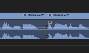
Re-watch each edit. Does it look smooth? If not, try taking off a few extra frames, using a different take, or overlapping the sound.
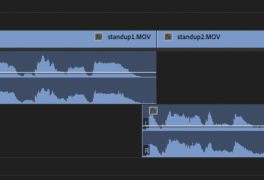
Overlapping sound is also used if characters are cutting each other off. The video of clip one should be shortened in the beginning and the audio should be moved to another track to overlap with the first clip, like this:
Adding music helps establish tone and theme, and can make it feel more like the characters in different shots are in the same space. If it’s an artistic choice not to have music, you can layer ambient sound underneath for the same effect.
TikTok has plenty of music built into the app that you should use. For other platforms, you need to be careful to use copyright-free music (Youtube will notice!). I have a paid subscription to Artlist that I use for most of my music and sound effects. I’ve also used music from Bensound, which is free as long as you properly credit them in the video description!
Most videos look better if you slightly increase the brightness, contrast, and black point. Resist the urge to add an intense filter unless you have a strong reason to do so. Filters are distracting and what the kids call “cheugy.”
Those are the basics out of my brain and into your hands. Now go off and bless the algorithms with your creativity!
Laura Merli is an NYC-based standup, actress, and writer. She’s amassed over a million likes on Tik Tok and continues to grow her following every day. She’s appeared in the Rogue Island Comedy Festival, the Women in Comedy Festival, was the first runner-up in The Ladies of Laughter standup competition, and hosts a monthly show (Good Girl) at one of the hottest alt-comedy spots in Brooklyn, Friends & Lovers.
As someone who didn’t start comedy until their late 20s, Laura has held a wide variety of odd jobs including cashier, eBay store photographer, project manager, zombie in an escape room, business analyst, and carnival worker (her grandparent’s family business). She has since written for and acted on sketch house teams at the PIT and Improv Boston. She’s also been a contributor to Reductress, The Hard Times, and McSweeney’s.
You can watch videos of her current sketch team, Soul Crush, at youtube.com/soulcrushcomedy.

